The Warcraft WordPress theme is mobile and responsive.
Theme has been integrated with Slicknav Menu plugin (let me highlight this – the menu integration is multi-level JQuery touch responsive menu).
The site is designed so that left sidebar with its widgets gets removed on mobile browsers but the footer 3 widgets remain and stack vertically.
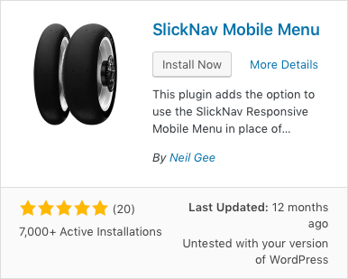
To activate the bile menu you need to install plug-in “SlickNav Mobile Menu”.

WP admin > Plugins > Add New > (search) SlickNav Mobile Menu
or install it by uploading the zipped version.
Configure the Slicknav Mobile Menu
WP Admin Panel > Settings > SlickNav Menu

Mobile Menu Demo on iPhone 11
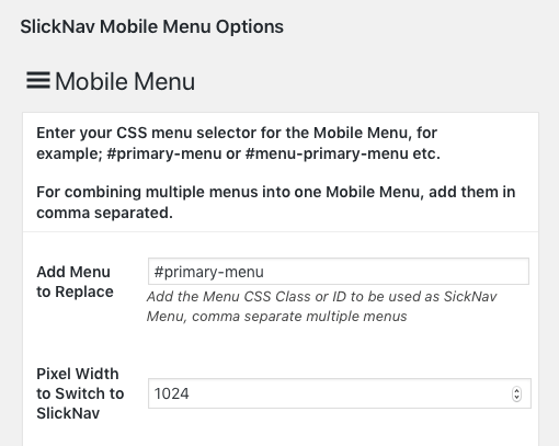
Two essential settings you need to enter are:
“Add Menu Replace” field.
Type #primary-menu in the form field.
“Pixel Width to Switch to SlickNav” enter 1024 in that field and press UPDATE at the bottom of the page to save the changes.
Everything else is colours etc. and is self explanatory.


I have installed SlickNav Mobile Menu, setup #primary-menu and 1024, but the menu does not show on my iPhone under iOS13 in Safari. I get a space for it, but there’s no icon there and when I press around, nothing pops up.
Hi Matt, I’d emailed you reply. Let me know if issue is resolved.